Thursday, April 28, 2011

Image Hoard: Spring Flash


It's time to release another bunch of pretty pics that I have been squirreling away.  Spring Flash is the excitement that comes with warmer weather (especially for us Brits) and the challenge of figuring out what to wear.

 Top left: All Saints
Top right: vintage graphic via MissMoss.co.za
Bottom: Proenza Schouler PS1 clutch (Available at Net-a-Porter)

Nude, neutral and antique colours have been making an impression on me, and for spring wear them with small flashes of bright or neon colour.

Left: from Value Restored series by Mitchel Cumming
Right: by Holly Fulton from A/W2011

Colour Comparison by Diana Moss: Erdem dress & Parisian garden seed pods

Diana Moss runs a beautiful blog at MissMoss.co.za and often puts up sharply creative colour comparisons, between fashion, paintings, portraits, photos, vintage graphics; just lovely.

Top left: Crystal Renn (again) by Chad Pitman for Muse Magazine
Right: Chance by Stella Im Hultberg
Bottom left: Vintage graphic via MissMoss.co.za

Thursday, April 21, 2011

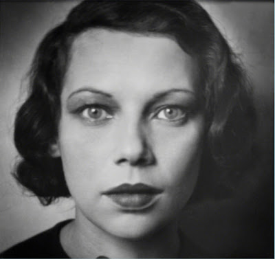
Hoppé at the National Portrait Gallery

'Tilly Losch, 1928' by E. O. Hoppé


Yesterday I visited the National Portrait Gallery to see an exhibition of photos by Emil Otto Hoppé.  Hoppé worked in London (and around the world) at the begining of the 20th century making portrait, travel and topographic images.  He was progressive for the time; with pared down aesthetics, ideas about capturing everyday people with hidden cameras and showing that beauty can cross boundaries of class and race.
I enjoyed the exhibition and the variation among the display categories of Society, Studio and Street.  The Society portraits are a veritable who's who of arts and culture in the early 20th century and the Street photos scrutinise the English like a foreign people, with all their peculiarities.  There was a particularly charming pic of a lady's behind as she mounted the stairs to exit the underground.  I couldn't find it on the web, so if you want a peek you'll have to shell out £11 for a ticket.  What I will show you are my sketches made in the show.  I was quite pleased with the way the last one looks like a Degas.


Warming up

Mimi Jordan, 1925

Tamara Karsavina as Columbine in Le Carnival, 1912

I'm expecting to see every open space in London resemble the picture below this weekend.  Bank Holiday Weekends + Sun mean everyone will be looking like lobsters by Tuesday.  Enjoy the sun and always wear sunscreen!

'A Cluster of Sunbathers, Bondi Beach, Sydney, 1930' by E. O. Hoppé


Wednesday, April 13, 2011

Louise Gray A/W'11 for Amelia's Magazine

I have had some more work featured on Amelia's Magazine website this week.  I illustrated three looks from Louise Gray's A/W 2011 collection that was just shown at Russian Fashion Week.  Have a look at Amelia's post on the show here.  


Tuesday, April 12, 2011

Image Hoard: Ectoplasm

Here is another collection of images I have liked and stolen from the interwebs.  I'm having a lot of trouble naming it, because there's not really much of a theme.  It's kind of squidgy and transparent, so 'Ectoplasm' will have to do.


1 - 'Entangled' by Kate MacDowell
This is a hand-built sculpture made from porcelain.  MacDowell is an artist making beautiful works in porcelain, commenting on humanity and nature, and the often uneasy relationship between the two.  'Entangled' is heartwarming and repulsive in the same instant; both touchy-feely and squirmy.

2 - Crystal Renn in 'Feast', photographed by Terry Richardson
Yes, maybe you remember it was Crystal Renn who featured in the Jimmy Choo ads I posted last week.  Good spot.  And yes, I'm mildly obsessed with her now.  This is part of a set that was printed in French Vogue last October, showing Renn stuffing herself on bountiful portions of a variety of foods.  It's hypnotically gaphic and slightly controversial, given Renn's personal battle with eating and weight.

3 - unidentified 'Dextro' image
This is an image I found on New City Movement blog (for "future forward music, design and culture").  I've not been able to find it again, even though I know it has something to do with Dextro; the DIY musician a.k.a. Ewan Mackenzie.  It looks like a digitally rendered smoke formation.  I would suggest watching the video for 'Momentary' by Dextro, which was created by Owen Harris and is pure haunting inky loveliness.

4 - Phaeodaria by Ernst Haeckel

5 - Atelier Chair for Adidas Australia by GoodWivesAndWarriors
The girls of GWAW use prolific monochrome patterning with flashes of colour.  I love the effect and so many of the patterns they use are inspired by science and natural forms.

6 - Siphonophore Tentacles
I don't know who took this picture, and I'm not entirely sure what it is.  But it sure is pretty.

Wednesday, April 6, 2011

What Would Jimmy Doo?


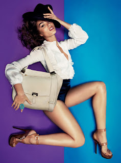
I have a small cold today, so I'm still in my PJs and will probably return to bed after lunch.  Not sexy, but at least these images bring a bit of glamour to my day!  I spotted the SS11 ads for Jimmy Choo in the March Vogue and knew I had to draw them.  They quite literally employ this season's trade-mark blocks of bright colour, and feature the absolutely gorgeous Crystal Renn.  

Original

It was they way the background colour reflects on her latex hotpants that gave me the idea of having the colours washed through everything.  I used coloured inks, gouache and india ink.  Please note that this isn't for Jimmy Choo, just for fun.