Tuesday, August 28, 2012

Brixton Market


On Saturday Kaylene Alder and I held a stall together at Brixton Market.  This was my first ever market experience (not going to market, I've been to a lot of markets).  I have been feverishly printing and wrapping and working on my offering in the past couple of weeks and I think it paid off.  We did a good job assembling a stall that looked well stocked and quite neat (which was in fact entirely held together with duct tape).

I think we will be doing more of these in the future.  I'll be sure to let you know when it will happen!

Until then I will shortly be listing some of the items I have produced on my Etsy shop.

Take a look at Kaylene's Etsy shop.

And enjoy some pictures from Saturday!...

Kaylene at the stall

Stally Wally


My mum insisted I pose with my name

And then made Kaylene do it too


A few of my cards

My new badge design

Monday, August 6, 2012

Fitzpleasure

I love alt-J.  I'm not alone in this, because their album 'An Awesome Wave' is amazing.  I wanted to create an illustration in response to their music.

One song that stood out to me from the beginning was 'Fitzpleasure'.  It has this amazing off beat choral intro and then a super dirty bass drop.  I read the lyrics and while very poetic, they are also dirty.  And then I found out about the short story that inspired the track - Tralala from Last Exit To Brooklyn by Hubert Selby Jr - which is just beyond dirty into abject and brutal.  Still, if you have the stomach for it it's a thought provoking read.  This image is influenced by the track, rather than the story.  


I'm at a little bit of a loss when it comes to explaining my choices (I created the image quite quickly) but I'll try...  

The main part of the picture is a yonic hand gesture, representing the obvious and a more spiritual and serene attitude.  There are several references to hands in the lyrics.  

"Steepled fingers, ring la-la-la-la-leaders, queue jumpers, rock fist paper scissors..."

The triangle in the background is delta, ∆ (the shortcut is alt+j on a mac), in clear and direct reference to the band.


The patterning around the wrists is in inspired by pylons.  They are strong but usually situated in a bleak landscape.

"Tall woman, pull the pylons down, and wrap them around the necks of all the feckless men who queue to be the next."

The cables also continue on from that sentiment.  They represent the visceral without being too graphic, and also show connection, turmoil, confusion and restriction.

The stain shape in the background is more directly from the ending of the Selby Jr story, but in general it's representative of the wake of destruction and dissipation and entropy: the dissolution of all things.


Sorry if this doesn't make a whole lot of sense and it sounds like I'm pussy-footing around the issue (it's because I am).  It should make more sense if you have dug into the 'Fitzpleasure' lyrics or have read the story.  I've done remarkably well to get to the end of this post without mentioning gang rape once.


Friday, August 3, 2012

Image Hoard: Always & Never


Book cover of Hemlock Grove by Brian McGreevy

This fantastic cover caught my eye.  I'm intrigued by the melodramatic werewolf novel that it represents as well.  It has very mixed reviews but it's being made into a series by Netflix and I think it might be worth a read.  I tend to judge books by their covers.


Above and below unknown images

These were pulled from an excellent, but sometimes disturbing blog of found images by Miron.


Above and below by Fin-DAC

Beautiful urban art, tightly controlled with a touch of chaos.  I think he does it all with spray paint.


Totem 2012 by Niark1

Crazy brilliant image by Parisian Designer/Illustrator Niark1.


Toujours et Jamais (Always & Never) by Pierre-Eugene-Emile Hébert

Hébert was a sculptor in Paris who had an unremarkable career aside from this piece in terracotta, which caught Baudelaire's eye at the 1859 Salon and remains a sensation on Tumblr.  It now lives in the Montreal Museum of Fine Arts.


Unknown


Unknown


Tuesday, July 24, 2012

Summer Crush

It's a sunny afternoon in London and you should probably be outside enjoying it, rather than inside reading blog posts.  If you want something to look at while you're out bathing in the sunshine then why not pick up a copy of CRUSHfanzine?  You can enjoy my portrait of Novak Djokovic and loads of other stunning work on paper.  You don't need to hack an unsecured WiFi network or even have any battery left to enjoy it.


Thursday, July 19, 2012

Tola's Morning

This is a commission for  a guy called Martyn Adams who is writing a novel about a parallel earth.  People are the same but their society and culture developed differently from ours.  The people are called  the 'Naha' and they live a more communal life in a buildings and collectives called 'Nahum'. 

This is the final illustration entitled 'Tola's Morning'.

Tola's Morning

This scene is from quite early in the book.  The main character - Tola - has been bereaved of her partner and is coming to terms with it.

I turns out her first assignment, when she goes back to work as a Law Enforcer, is to visit our version of Earth to track down some rogue agents.

I thought I would show you some of my very sketchy sketches and development.

Character sketch of Tola

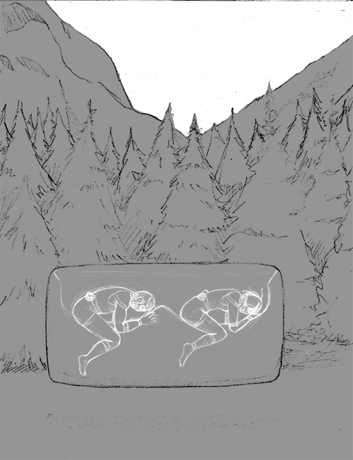
These are my thumbnails for the Illustration, thinking about content and positioning.

Initial garbled sketches for the illustration


Progression

Selection

Refinement


As you can see I left out Iyan (the dude sleeping) in the final thing, mostly for the sake of the composition and it doesn't quite make sense in this picture.

Learning about a whole other Earth can get very complicated, as you might imagine.  There is a Naha language, different customs and lifestyle and their technology is much more advanced than ours.  I did quite a bit of concept sketching, developing the look of characters, technology and architecture.  


Concept sketch for 'Nahum' structures with a good portion of the buildings below ground


Tola arriving for briefing

The main type of transport in the book is in a Relkim.  It is a floating, flying vehicle which looks like pretty much like a big metal pillow.  Drawing it was pretty easy.  What was harder was figuring out what's going on inside.

Development for 'Relkim' wear and masks

'Relkim' concept sketch

The Naha also have implants for computing and communication, but that's a whole other story.


Tuesday, July 10, 2012

Bikini babes for Tesco Magazine

I was commissioned by Cedar Communications to supply some drawn elements for the last issue of Tesco Magazine.  The spread showcases swimwear for different body shapes and required lady-like silhouettes on which to show bikinis that had been photographed on a mannequin.  Magic.

The spread by Cedar Communications, showing my beach babes

Detail of the layout

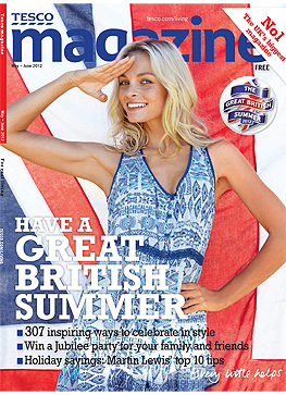
The issue was May/June, so I'm not sure you'll find it in stores any more.  Just in case, here's the cover to look out for...

Monday, July 2, 2012

String Section

Here's an image I did last week.  The brief was quite open; just a drawing of a violin really.  


Whenever a drawing requires some inky parts I go a bit crazy, 'just in case'.  I will definitely use some of these other ones for something or other...


And just for good measure here's a video of Owen Pallett doing some unexpected things with a violin.